
How to you react to these statements versus their data viz counterparts:
Data visualizations often engages with the language of the body more readily than the written word.
Philosopher Samuel Todes asserts that our own human body is the underlying metaphor through which we make sense and meaning of the world, and thus, as Stephen Neely asserts, the “designer has to offer a primary interaction or secondary metaphor to foster meaning. Metaphors closer to the feeling of the body—such as plant and human forms, animations, 3D shapes, etc.—create more visceral and profound meaning for us than those that rely on many layers of abstraction, such as geometric primitives or the English language. — Me, in an article on Data Science by Design, source
Image and metaphor helps understand on a more profound, embodied level.

An estimated 2,996 people died in the 9/11 attacks. Posters and footage reveal this more readily than numbers written on a page. Source: Steve Pyke, Missing, September–November, 2001
Images also more readily show data as evidence of phenomena (for good and for bad). Using visuals as persuasive evidence is a key theme in the history of data visualizations.

Map by John Snow showing the clusters of cholera cases in the London epidemic of 1854, drawn and lithographed by Charles Cheffins

Simulation of tear gas used by Portland police on protesters in 2020 by Forensic Architecture. FA uses data visualization (in concert with video or other primary sources) to demonstrate evidence of injustice.
”Despite being broadly banned in warfare under the terms of the 1925 Geneva Protocol, tear gas as an agent for so-called ‘riot control’ has become the preferred means for police, in the US and around the world, to clear dissenting voices from public spaces. But the toxic chemicals contained in tear gas and other widely-used chemical munitions can cause serious short- and long-term side effects, from asthma and chemical burns to lung injury and neurodegeneration.“
Much of my philosophy on how to visualize data is manifested in my research, Feral Data Visualization:

Historically significant data viz

Causes of Mortality in the Army of the East by Florence Nightingale
"Nightingale's second batch of visualizations was her most stunning graphic achievement. The three-diagram set was originally issued in a confidential report to Queen Victoria. After the sanitation reformers were attacked in an anonymous pamphlet, Nightingale and her team repackaged the diagrams with a final rebuttal for public consumption. These graphics form a narrative that exposed the problem (too many deaths), revealed its cause (preventable disease) and offered lifesaving solutions (sanitary reform). The first diagram, shown here, emphasizes the problem by comparing the monthly rate of army mortality across two years (radiating wedges) with the average mortality rate in the city of Manchester (inner circle). Credit: Harvard Library” Scientific American
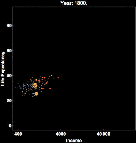
Hans Rosling
”His best-known lecture, “The Best Stats You’ve Ever Seen,” was presented at a 2006 TED conference. Rosling used statistics to show that worldwide fertility was decreasing and that the era of fast population growth would therefore end by mid-century, that the distinction between developed and developing countries has blurred, that global health is improving, and that extreme poverty in the world is decreasing.” Britannica